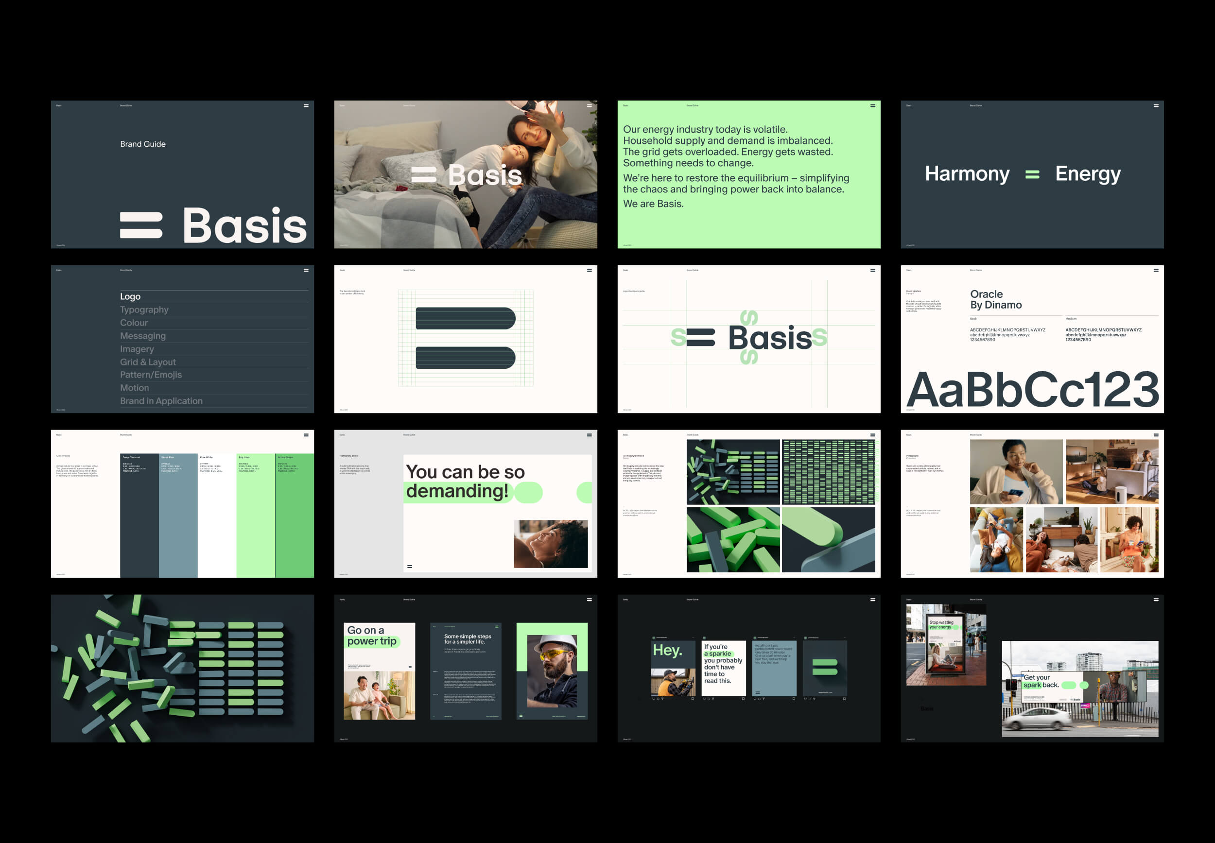
Harmony with energy
Today's energy industry is volatile. Household supply and demand are imbalanced. The grid gets overloaded, and energy is wasted. Basis is here to restore the equilibrium – simplifying the chaos and bringing power back into balance. Their software and hardware operate silently in the background of your home – intelligently distributing renewable energy, saving precious time, money, and resources.
Basis wanted their brand to be simple, practical and memorable. South’s brand idea was ‘Harmony with Energy’. This informed all creative throughout their brand. The two counter-spaces within the Basis ‘B’ expand to become an ‘equals’ logo mark – a symbol of harmony, equality, and simplicity. A dynamic highlighting device, born from the logo, emphasises keywords within the brand's playful yet informative messaging. The logo is abstracted in 3D form to communicate the wider narrative around restoring balance to the grid. A gridded logo pattern further delivers on this theme. Layouts fall on a equal 50/50 grid. A fresh colour palette and warm, relaxed imagery gives advertising a contemporary yet approachable feel.
Services
Brand strategy and foundations
Brand identity and business tooling
3D, and motion design
Verbal identity
Brand and communication guidelines
Brand 3D Motion
Cassidy Van Dyk
Product 3D Motion
2D Motion
Field Of Play