Branded, brick by brick.
Build burst onto the scene with a bold, cheeky voice and a lively social presence that turned heads fast. Two years on, they needed their brand to evolve, retaining their edge while positioning them as confident, capable professionals.
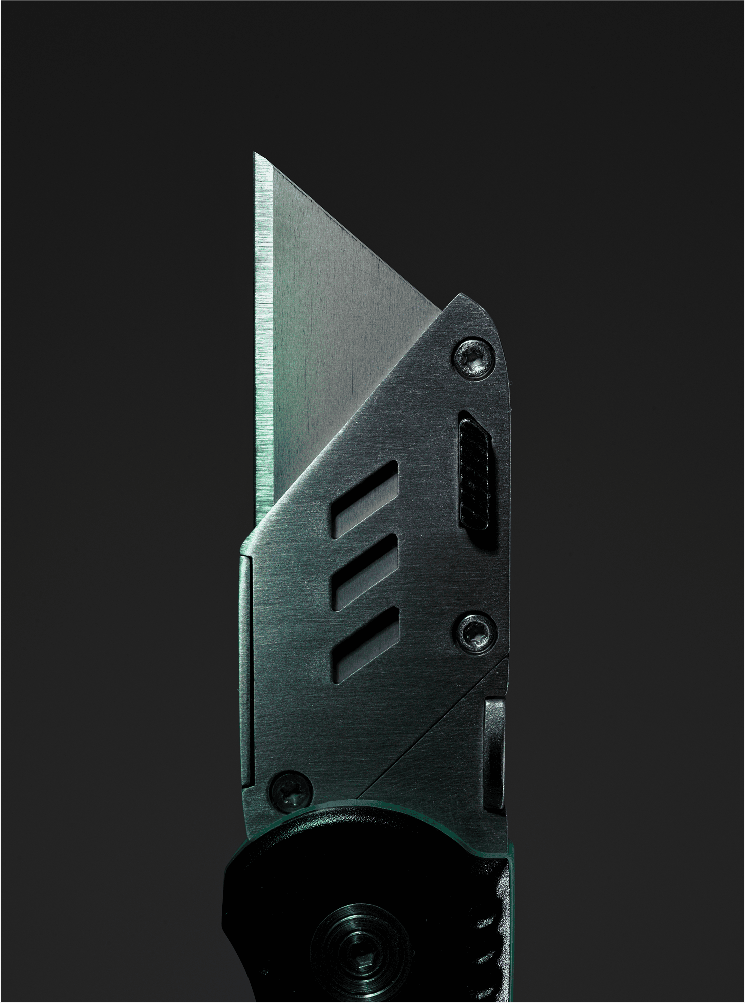
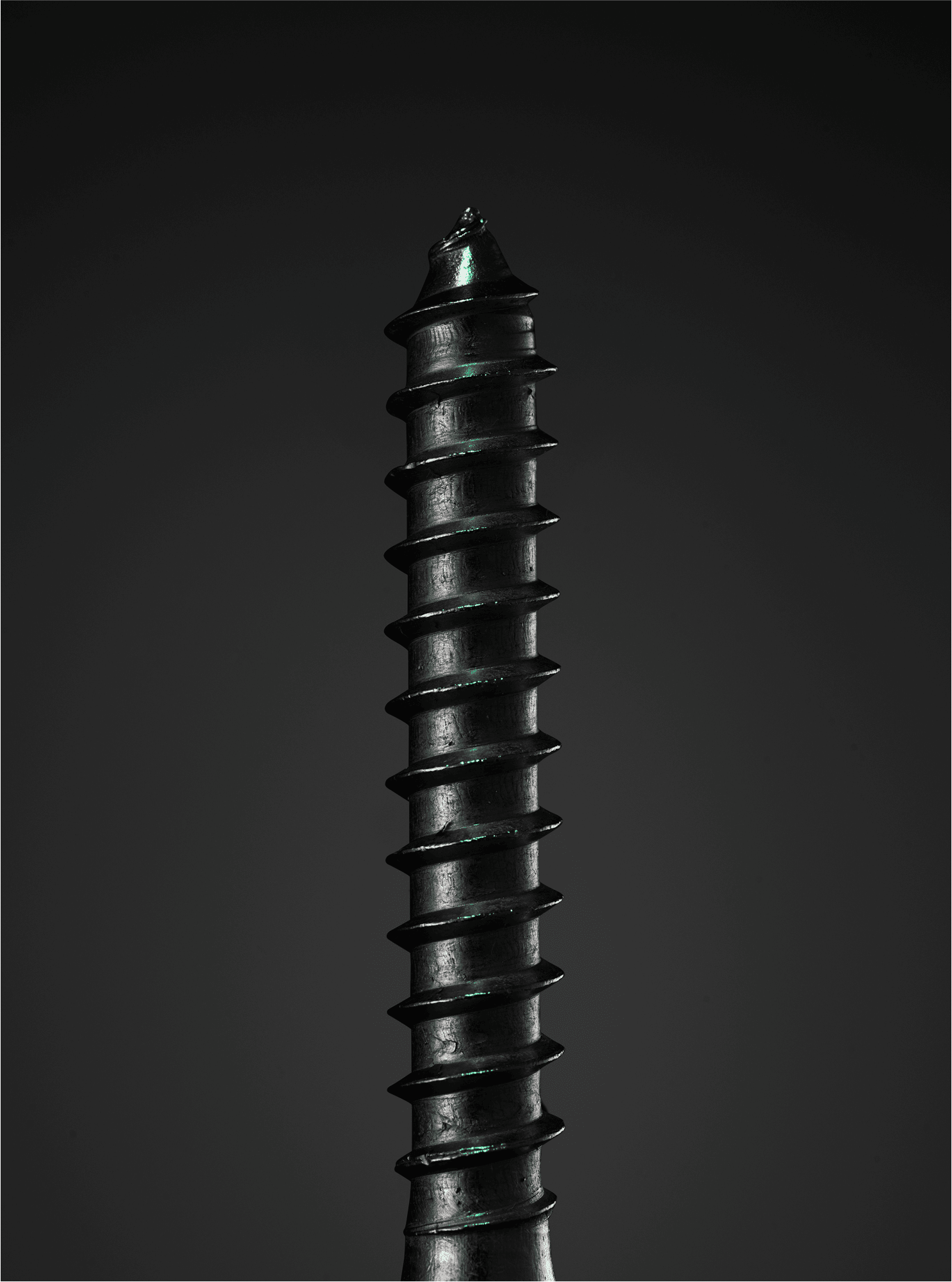
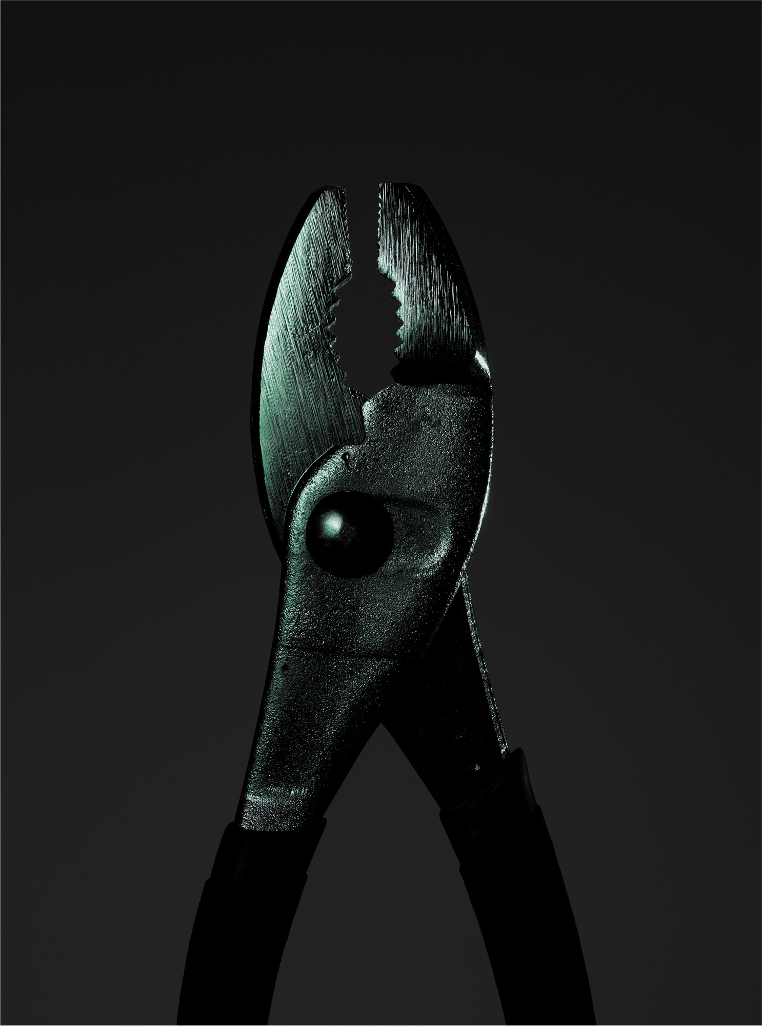
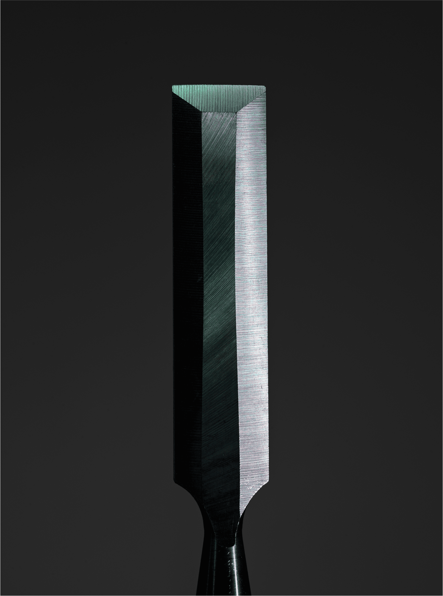
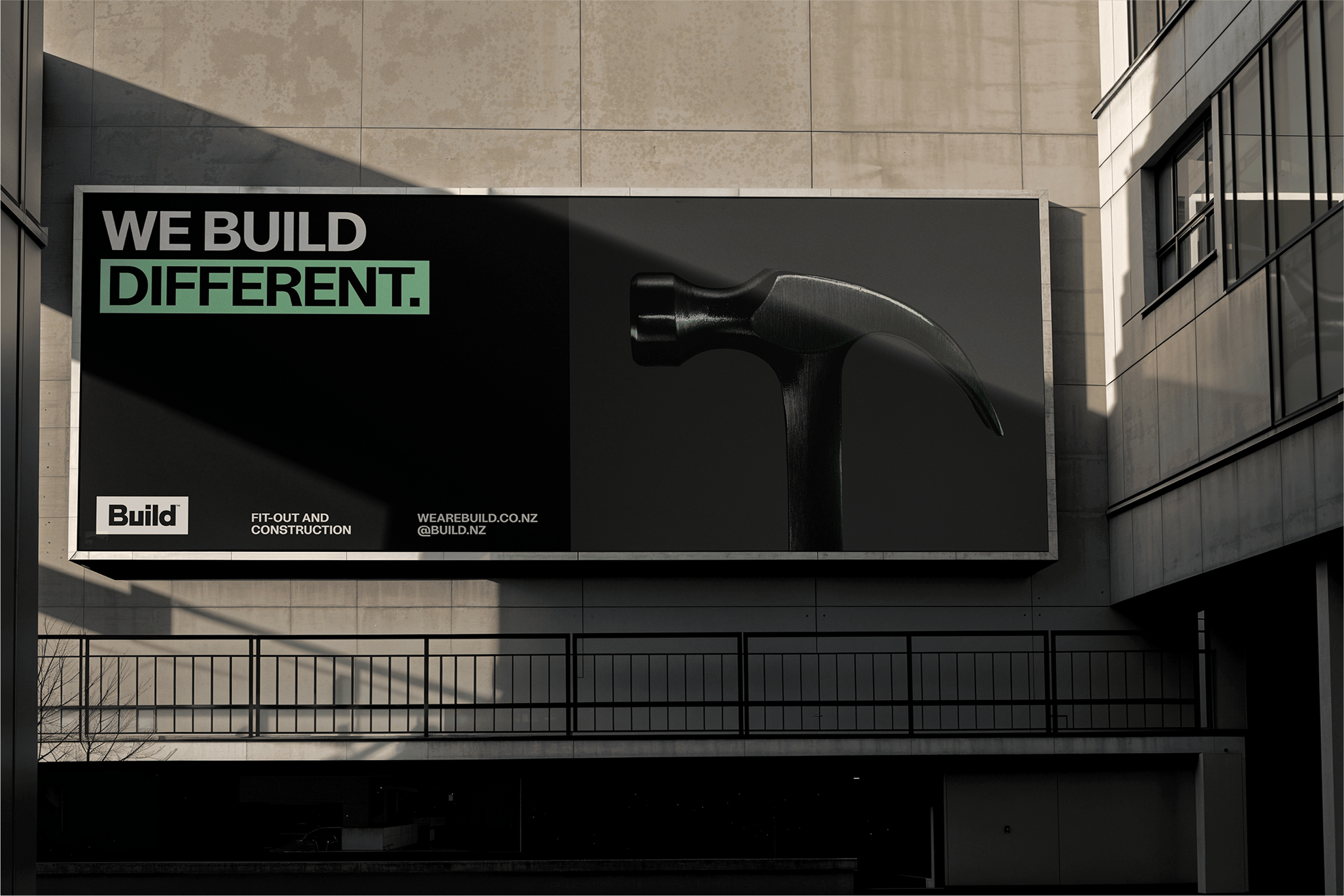
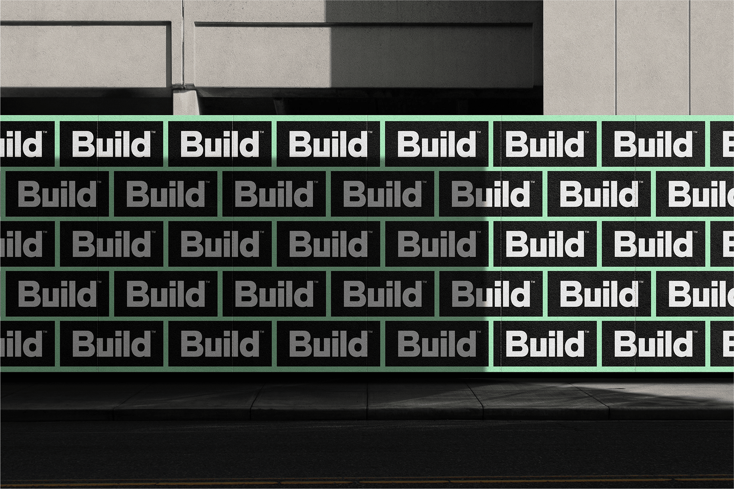
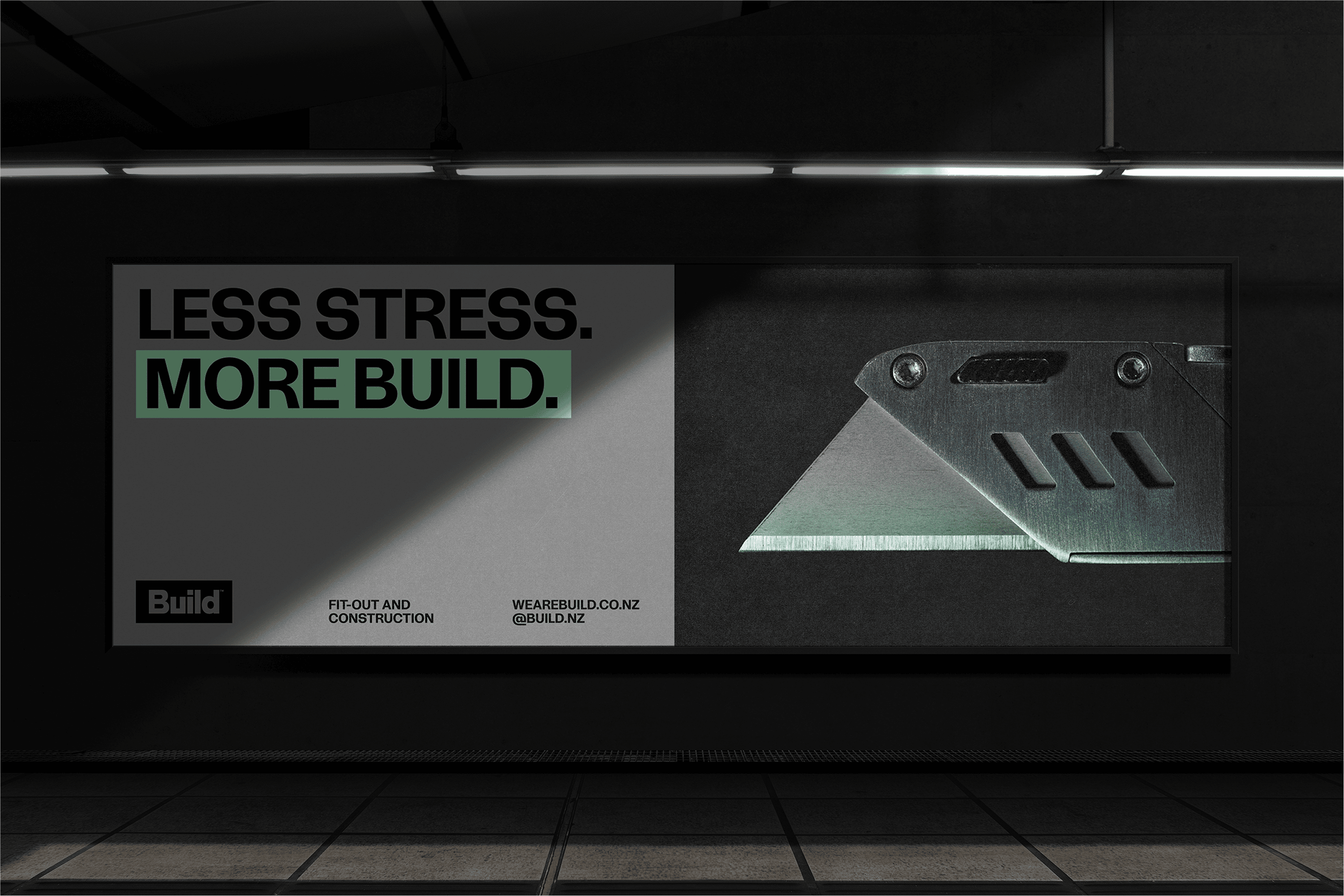
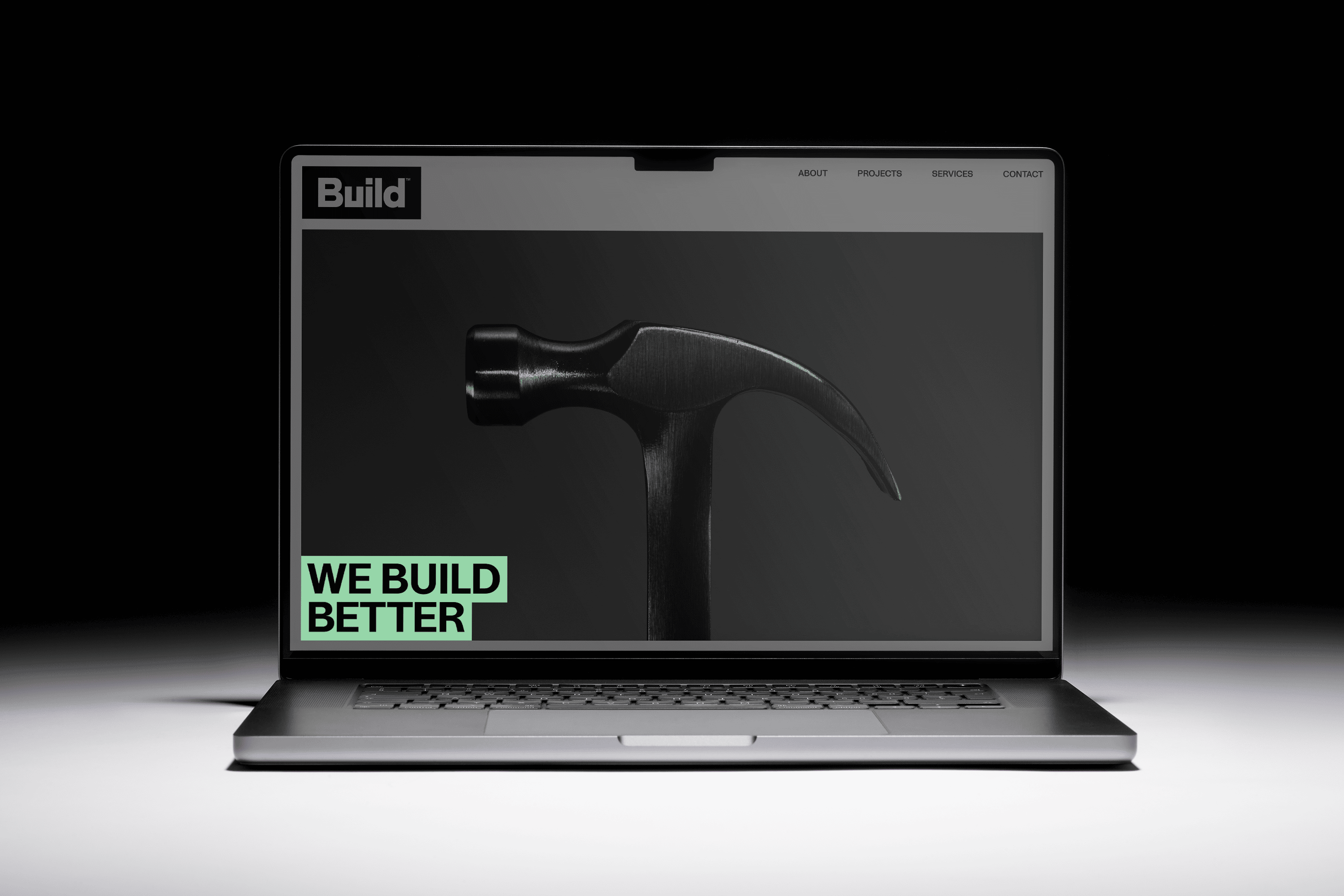
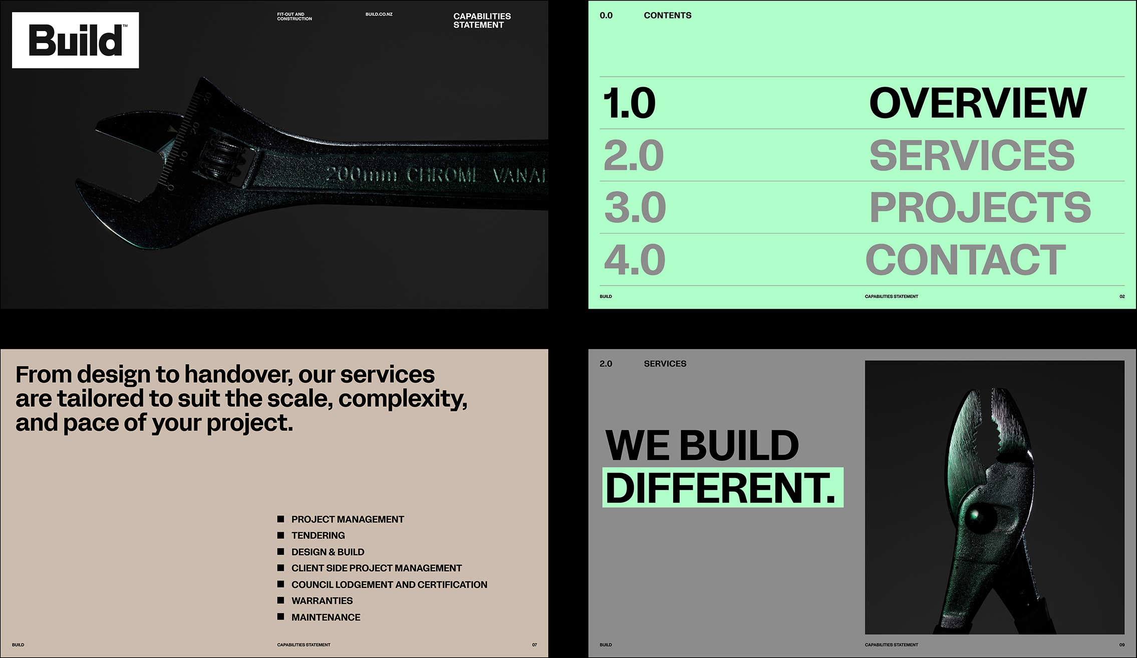
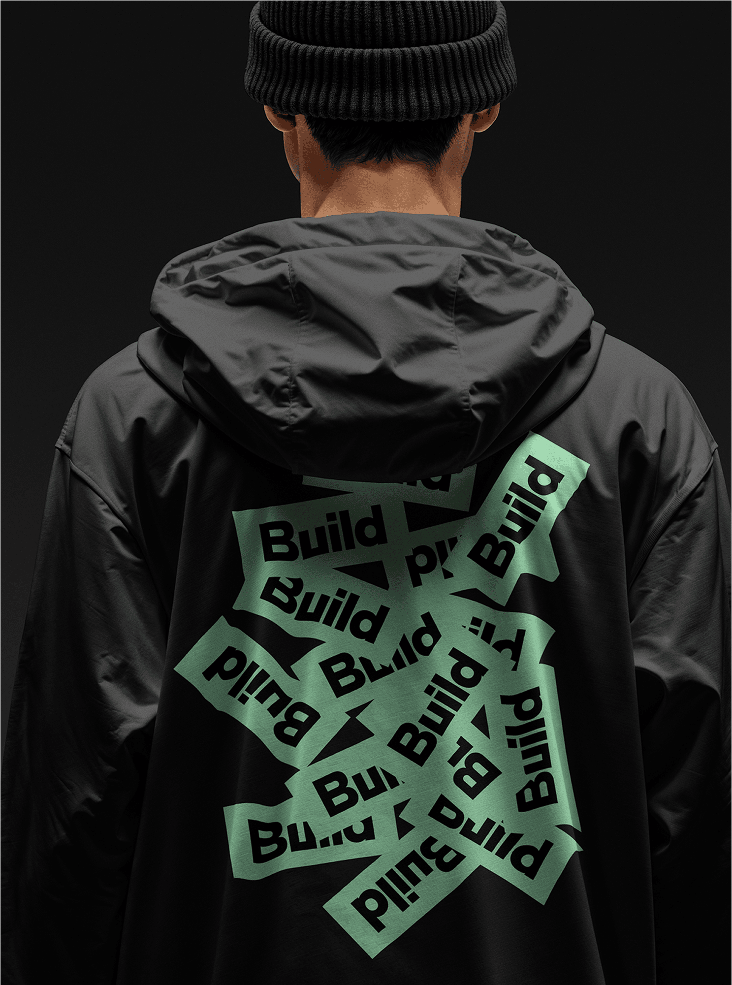
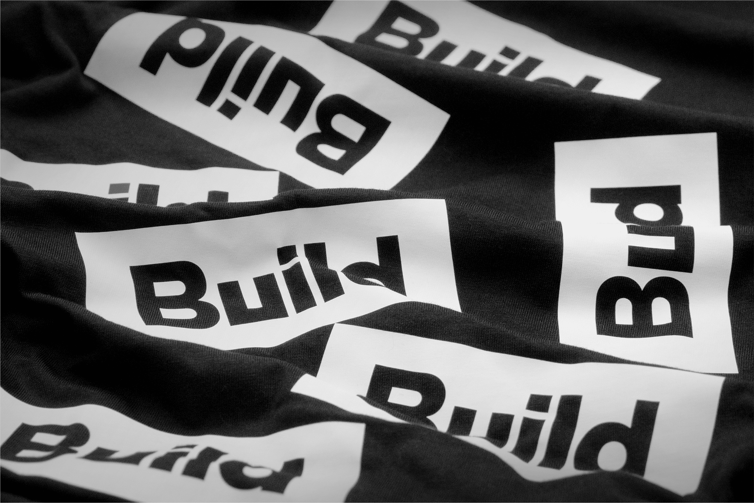
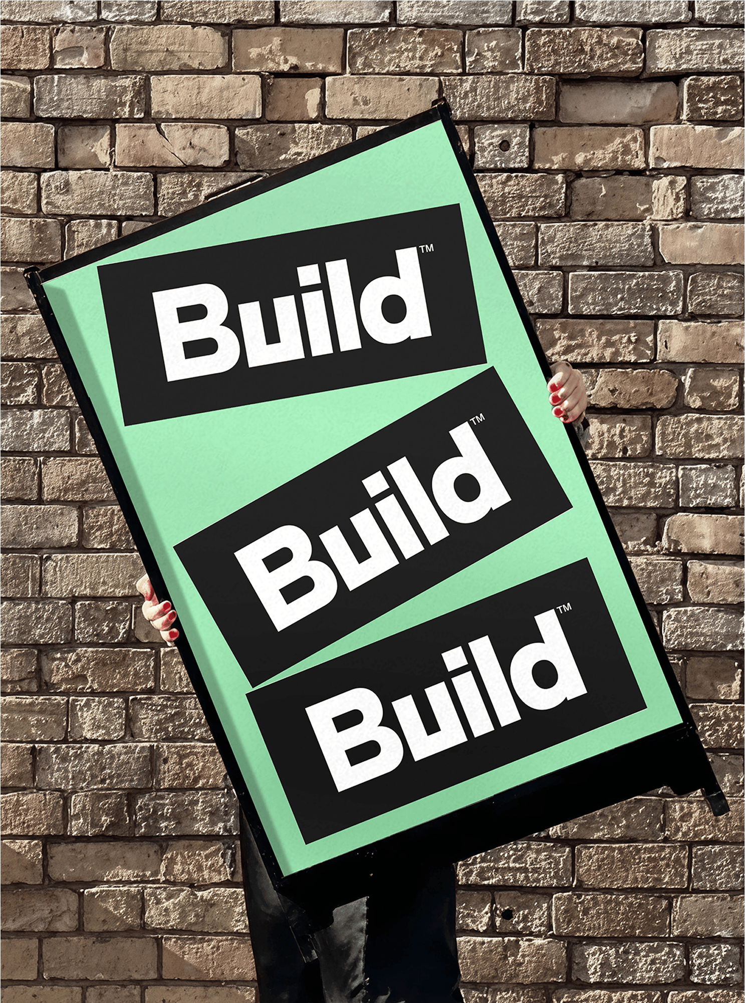
Anchored in simplicity, energy, and quality, the new identity centres on a bold, geometric wordmark in a solid block, symbolising strength and dependability. Motion adds dynamism, reflecting the energy Build brings to every project. Their black-and-white palette stays for clarity, punctuated by mint green for a modern edge, balanced with warm sand tones for refinement. Build’s tone of voice is clear, confident, and sharp – no fluff, just clarity with character. Imagery focuses on tools of the trade, shot with dramatic lighting and macro precision to elevate them into artefacts of craft and wonder, with subtle green highlights for brand presence.
The result is a bold, design-led identity that redefines what a construction brand can be: sharp, self-assured, and always building better.
Services
Brand Identity
Copywriting
Motion
Website
Photography
Toaki Okano